ShopDreamUp AI ArtDreamUp
Deviation Actions
Daily Deviation
Daily Deviation
November 24, 2006
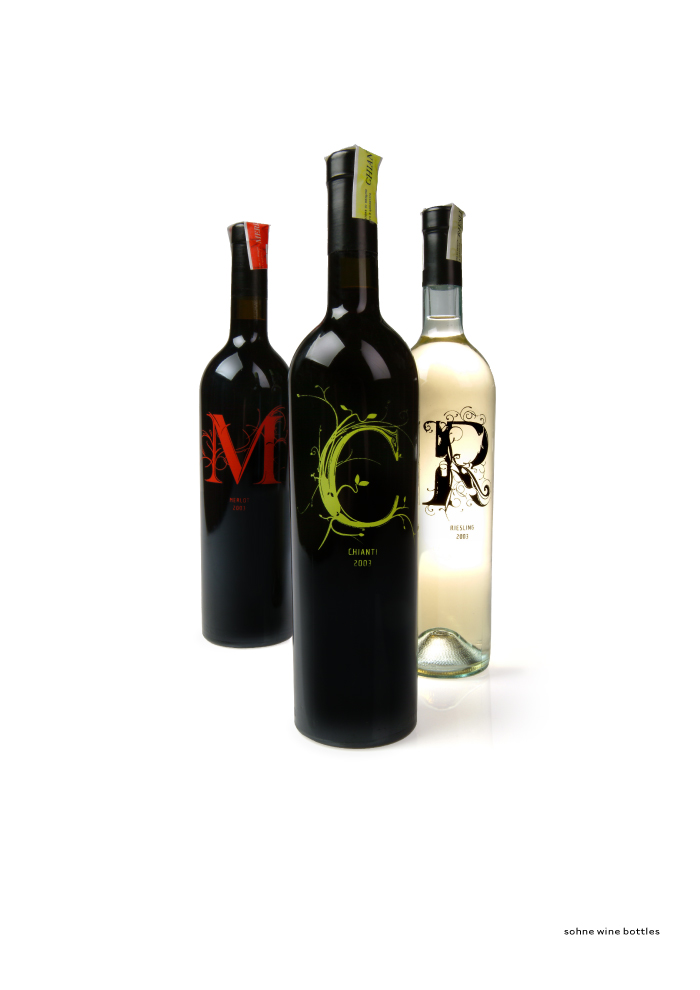
With packaging like Wine Inc. - Wine Bottle Design by =nedw I'd definitely pick this up out of a line up since I don't know wine. I'd rely on colour and packaging and this is just simple and effective.
Featured by depthskins


Description
The concept here is pretty straightforward:
Wine makers often focus on a straightforward brand, such as kendel jackson, or robert mondavi. This brand of wine focuses on the taste, and quality that goes into their product, letting the taste and quality of the wine speak for itself.
Each letter was designed to reflect the process that the wine goes through as its made, as well as the bouqet of tastes that the wine contains.
I'm thinking about adding a small ring (the color of the top vat sticker) to help transition the black seal into the bottle... Comments/Ideas?
Image size
700x990px 116.92 KB
© 2006 - 2024 nedw
Comments403
Join the community to add your comment. Already a deviant? Log In
sorry man i thought this was a font...i understand now this is an art...i didn't mean to insult your art...